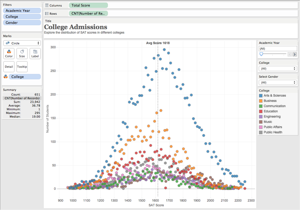
A short tale of… data vizes. It’s about Tableau, R, and Shiny. How to prepare/build an existing and well-known Tableau visualization with R and provide web analysis interactivity. Will be using the raw data from the sample workbook named “Regional” that comes with Tableau Desktop. The following image below is a snapshot of the visualization that we will try to reproduce with R. You can also view and interact with this visualization on my Tableau Public profile page -> http://tabsoft.co/22IOMjD
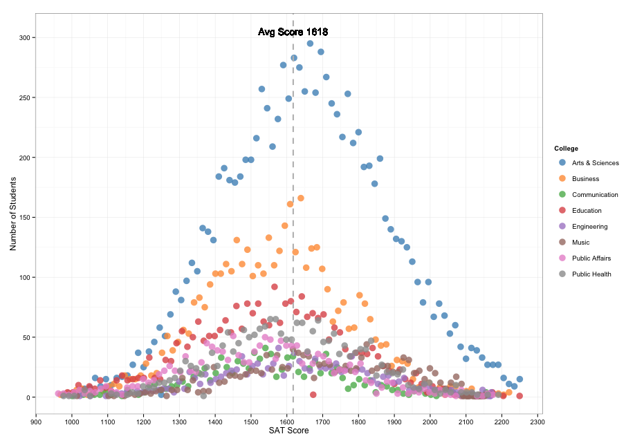
Let’s start by recreating the same visualization (static) with R. Open RStudio, copy and paste the following R code and run it.
|
|
The output will produce the following, a nice simple static plot… of course with no interactivity!
Then comes Shiny by RStudio which is a web application framework for R that turns your analyses into interactive web applications. Check out the Getting Started Guide for all the details.
Shiny apps have two important components:
- a user-interface script (ui.R) which controls the layout and appearance of your app
- a server script (server.R) which contains the instructions needed to build the app You can actually run the app locally in RStudio by copying the following 2 R scripts
library(dplyr)
library(ggvis)
library(shiny)

shinyUI(fluidPage(

  h3("College Admissions"),
  p("Explore the distribution of SAT scores in different colleges"),

  sidebarLayout(position=c("right"),
    sidebarPanel(width=2,
      selectInput(inputId = "n_year",
                  label = "Academic Year",
                  choices = c("(All)", "2013", "2014"),
                  selected = "(All)"),

      selectInput(inputId = "n_college",
                  label = "College",
                  choices = c("(All)", "Arts & Sciences", "Business", "Communication", "Education", "Engineering", "Music", "Public Affairs", "Public Health"),
                  selected = "(All)"),

      selectInput(inputId = "n_gender",
                  label = "Gender",
                  choices = c("(All)", "Men", "Women"),
                  selected = "(All)")
      ),
    mainPanel(
      uiOutput("plot"),
      ggvisOutput("ggvis")
    )
  )
))
library(dplyr)
library(ggvis)
library(shiny)
sat_score = read.csv("/Data/TableauDataSet_Education.csv")
sat_score$Total.Score < - as.numeric(as.character(sub(",", "", sat_score$Total.Score)))
sat_score$Academic.Year <- as.numeric(as.character(sub(",", "", sat_score$Academic.Year)))
shinyServer(function(input, output) {
data <- reactive ({
if (input$n_college == "(All)" && input$n_gender == "(All)" && input$n_year == "(All)"){
by_college <- group_by (sat_score, College, Total.Score)
college_score <- summarise(by_college , NumberOfStudents = n())
}
else if (input$n_college == "(All)" && input$n_gender == "(All)" && input$n_year != "(All)"){
by_college <- group_by (sat_score, College, Academic.Year, Total.Score)
college_score <- summarise(by_college , NumberOfStudents = n())
college_score <- filter(college_score, Academic.Year == input$n_year)
}
else if (input$n_college == "(All)" && input$n_gender != "(All)" && input$n_year != "(All)"){
by_college <- group_by (sat_score, College, Gender, Academic.Year, Total.Score)
college_score <- summarise(by_college , NumberOfStudents = n())
college_score <- filter(college_score, Gender == input$n_gender, Academic.Year == input$n_year)
}
else if (input$n_college != "(All)" && input$n_gender != "(All)" && input$n_year != "(All)"){
by_college <- group_by (sat_score, College, Gender, Academic.Year, Total.Score)
college_score <- summarise(by_college , NumberOfStudents = n())
college_score <- filter(college_score, College == input$n_college, Gender == input$n_gender, Academic.Year == input$n_year)
}
else if (input$n_college != "(All)" && input$n_gender != "(All)" && input$n_year == "(All)"){
by_college <- group_by (sat_score, College, Gender, Total.Score)
college_score <- summarise(by_college , NumberOfStudents = n())
college_score <- filter(college_score, College == input$n_college, Gender == input$n_gender)
}
else if (input$n_college != "(All)" && input$n_gender == "(All)" && input$n_year == "(All)"){
by_college <- group_by (sat_score, College, Total.Score)
college_score <- summarise(by_college , NumberOfStudents = n())
college_score <- filter(college_score, College == input$n_college)
}
else if (input$n_college != "(All)" && input$n_gender == "(All)" && input$n_year != "(All)"){
by_college <- group_by (sat_score, College, Academic.Year, Total.Score)
college_score <- summarise(by_college , NumberOfStudents = n())
college_score <- filter(college_score, College == input$n_college, Academic.Year == input$n_year)
}
else if (input$n_college == "(All)" && input$n_gender != "(All)" && input$n_year == "(All)"){
by_college <- group_by (sat_score, College, Gender, Total.Score)
college_score <- summarise(by_college , NumberOfStudents = n())
college_score <- filter(college_score, Gender == input$n_gender)
}
})
college_tooltip <- function(x){
with(sat_score[x$id, ], paste("<b>", "College of ", x$College, "<br />",
"Total Score: ", "<b>", x$Total.Score, "</b><br />",
"# number of Students: ", "<b>", x$NumberOfStudents, "</b><br />"))
}
data %>%
ggvis(y=~NumberOfStudents, x=~Total.Score, stroke:="black", fill=~College) %>%
layer_points() %>%
add_axis("x", title="SAT Score") %>%
add_axis("y", title="Number of Students") %>%
add_tooltip(college_tooltip, "hover") %>%
set_options(width=975, height=700) %>%
bind_shiny("ggvis", "plot")
data
})
I have published this app on Shiny for you to explore and interact with https://sfrechette.shinyapps.io/college_admissions
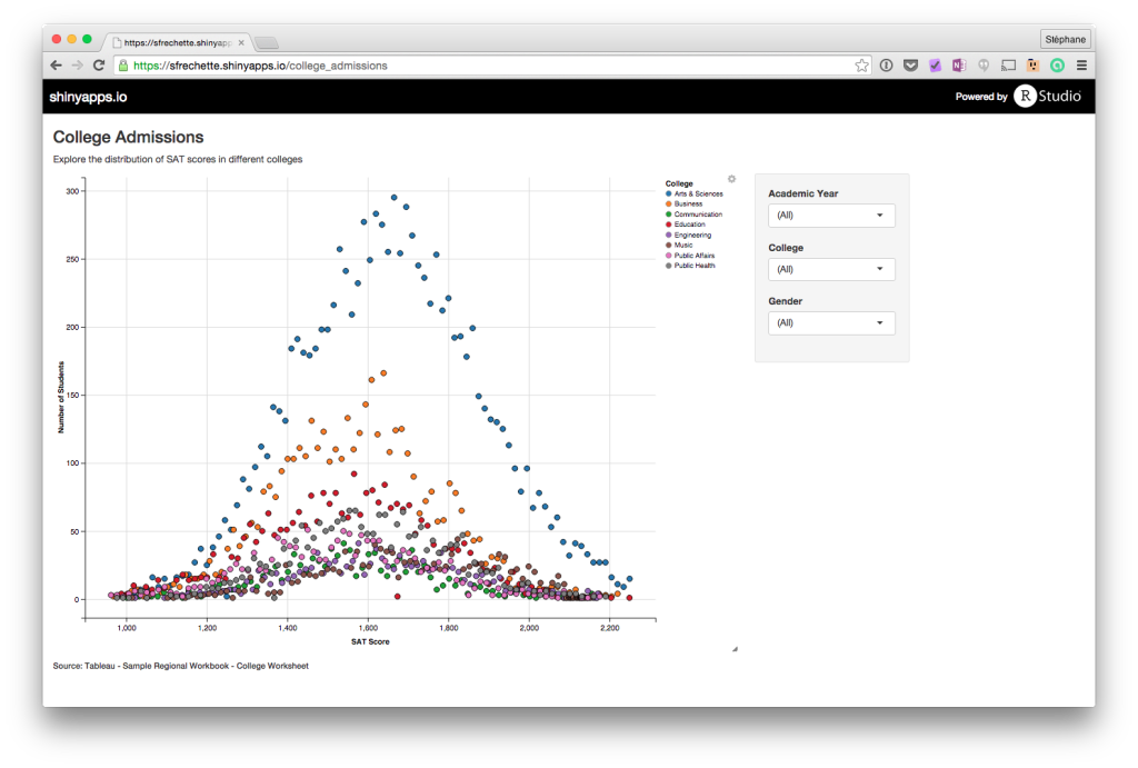
So from Tableau to R and Shiny we have almost the same data visualization and interactivity
I am using the ggvis package and it seems impossible to add a horizontal line to a plot for the average score… feature apparently not available yet!