The more you used it, the more you discover great stuff… I wanted to do some analysis with some weather data, but did not want to start searching and scraping sites, then merging and cleansing…you know the drill. So I came across this neat R package named weatherData. weatherData provides functions that help in fetching weather data from websites, documentation found here -> https://ram-n.github.io/weatherData/.
So I got inspired to compare Ottawa weather and Ottawa JavaScript Meetup attendance! Even with only 33 meetups (observations) in the past 3+ years, I thought it would be interesting to see if there any correlation between them? Ottawa weather vs. Ottawa JavaScript Meetup attendance: an R analysis
First we need to load some required libraries (packages) and write a function to get the weather data we need:
library(weatherData)
library(dplyr)
library(ggplot2)
library(gridExtra)

# Ottawa International Airport (YOW) weather data
getWeatherForYear = function(year) {
    getWeatherForDate('YOW',
                      start_date= paste(sep='', year, '-01-01'),
                      end_date = paste(sep='', year, '-12-31'),
                      opt_detailed = FALSE,
                      opt_all_columns = TRUE)
}

# Execute functions - get data
df_weather = rbind(getWeatherForYear(2012),
                    getWeatherForYear(2013),
                    getWeatherForYear(2014),
                    getWeatherForDate('YOW', start_date='2015-01-01',
                             end_date = '2015-02-11',
                             opt_detailed = FALSE,
                             opt_all_columns = TRUE))
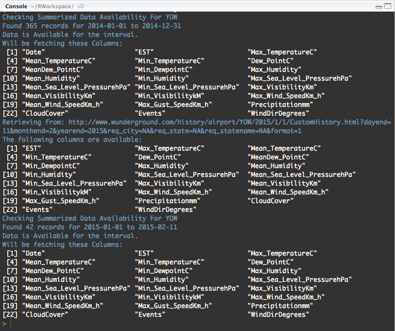
Your Console window will output similar to the following:
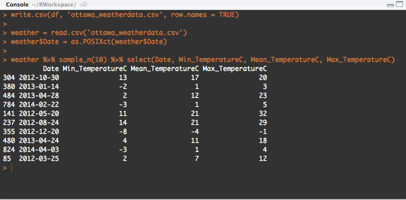
Once data as been fetched we need to write and save it to a CSV file. Then we can read from CSV and sample the first 10 records with specific columns
write.csv(df_weather, 'ottawa_weatherdata.csv', row.names = TRUE)

weather = read.csv('ottawa_weatherdata.csv')
weather$Date = as.POSIXct(weather$Date)

weather %>% sample_n(10) %>% select(Date, Min_TemperatureC, Mean_TemperatureC, Max_TemperatureC)
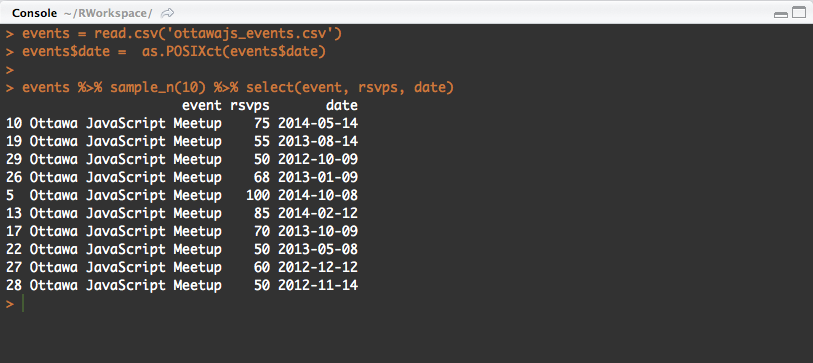
Next we need to load the Ottawa JavaScript Meetup data which I already fetched and stored here in a CSV file (note: only 33 events, and unfortunately the name of of events do not have the topics and sessions that were presented on these dates… meh!)
events = read.csv('ottawajs_events.csv')
events$date =  as.POSIXct(events$date)

events %>% sample_n(10) %>% select(event, rsvps, date)
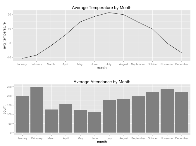
With our two datasets (data frames) loaded we can now manipulate, group and plot. Let’s get the average attendance and temperature by month:
# Group average attendance event by month
by_month = events %>%
    mutate(month = factor(format(date, "%B"), levels=month.name)) %>%
    group_by(month) %>%
    summarise(events = n(),
              count = sum(rsvps)) %>%
    mutate(avg = count / events) %>%
    arrange(desc(avg))

# Group average temperature by month
averagetemperature_bymonth = weather %>%
    mutate(month = factor(format(Date, "%B"), levels=month.name)) %>%
    group_by(month) %>%
    summarise(avg_temperature = mean(Mean_TemperatureC))

plot_temperature = ggplot(aes(x = month, y = avg_temperature, group=1), data = averagetemperature_bymonth) +
    geom_line( ) + ggtitle("Average Temperature by Month")

plot_attendance = ggplot(aes(x = month, y = count, group=1), data = by_month) +
    geom_bar(stat="identity", fill="grey50") +
    ggtitle("Average Attendance by Month")

grid.arrange(plot_temperature, plot_attendance, ncol = 1)
Examining the plots, we can see a slight inverse correlation between February and June (March – black sheep!), meaning that as the temperature starts increasing, the total attendance slightly decreases. And from July to November, as temperature decreases, attendance slightly increases!
Let’s go more granular by comparing specific dates. We need to add (mutate) a new column to our existing events data frame, merging it to our weather data frame and let’s plot the attendance against the average temperature for individual specific days:
# Group by day
by_day = events %>%
    mutate(day = (as.POSIXct(events$date))) %>%
    group_by(day) %>%
    summarise(events = n(),
              count = sum(rsvps)) %>%
    mutate(avg = count / events) %>%
    arrange(desc(avg))
weather = weather %>% mutate(day = Date)
merged = merge(weather, by_day, by = 'day')

ggplot(aes(x = count, y = Mean_TemperatureC, group = day), data = merged) + geom_point()
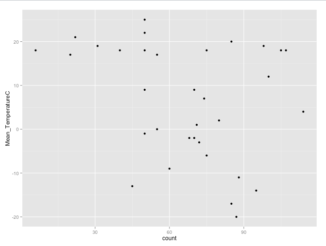
Interesting, there doesn’t seem to be any strong correlation between the temperature and the attendance. We can confirm our doubts by running a correlation:
# Any correlation between the temperature and attendance?
cor(merged$count, merged$Mean_TemperatureC)
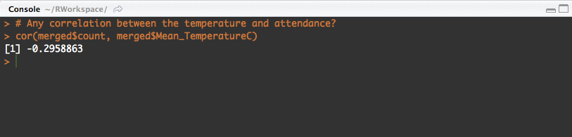
We get a weak downhill (negative) linear relationship: -0.2958863
There must be other variables than temperature that is influencing event attendance per month. My hypothesis would be that we would see lower attendance during March break, and the start of summer school vacation (June, July, August), but in this case July and August are up!
That for now pretty much puts an halt to my Meetup attendance prediction model.
Thus insightful and worthwhile using R in trying to better understand data and finding relationships (That’s What It’s All About)
What I would like to analyze are data sets related to daily museum, parcs, library attendance. If you have any other interesting suggestions please let me know, we could work at it together.
GitHub Gist available here -> https://gist.github.com/sfrechette/585e4ca9cdab7eacc92b